Q&A 5 How do you compare GDP trends across EAC countries on a single plot?
5.1 Explanation
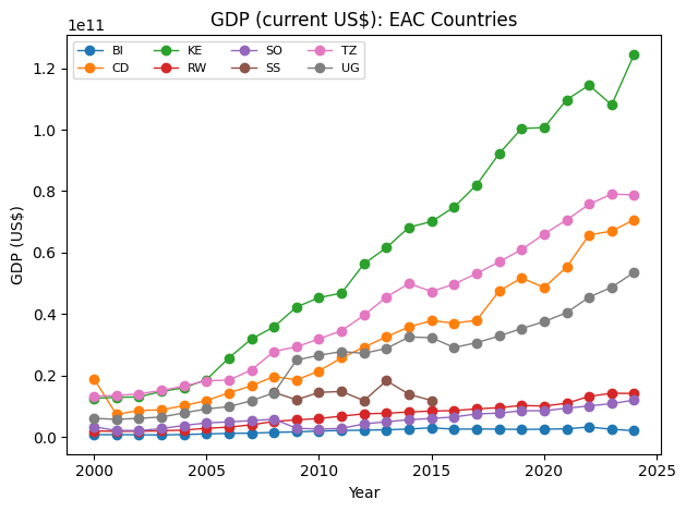
When comparing economies of similar scale, it helps to restrict the set to the EAC countries only. This balances the chart by removing the very large US economy, which would otherwise dominate the scale.
You can plot GDP in absolute terms and also as an indexed series (e.g., base year = 2000 → 100) to highlight relative growth rates.
5.2 SQL/MySQL Code
-- Absolute GDP for EAC countries
SELECT country, year, gdp_usd_current
FROM gdp_wdi
WHERE country IN ('KE','TZ','UG','RW','BI','SS','SO','CD')
ORDER BY country, year;

-- Optional: coverage check
SELECT country, COUNT(*) AS n_years, MIN(year) AS min_year, MAX(year) AS max_year
FROM gdp_wdi
WHERE country IN ('KE','TZ','UG','RW','BI','SS','SO','CD')
GROUP BY country
ORDER BY country;

-- Optional: coverage check
SELECT country, COUNT(*) AS n_years, MIN(year) AS min_year, MAX(year) AS max_year
FROM gdp_wdi
WHERE country IN ('KE','TZ','UG','RW','BI','SS','SO','CD')
GROUP BY country
ORDER BY country;
5.3 Python Code
import os
import pandas as pd
import matplotlib.pyplot as plt
from sqlalchemy import create_engine, text

# --- Connection ---
user = os.getenv("DB_USER", "root")
pwd  = os.getenv("DB_PASS", "")
host = os.getenv("DB_HOST", "127.0.0.1")
port = int(os.getenv("DB_PORT", "3306"))
db   = os.getenv("DB_NAME", "cdi_economics")
engine = create_engine(f"mysql+pymysql://{user}:{pwd}@{host}:{port}/{db}")

EAC_COUNTRIES = ('KE','TZ','UG','RW','BI','SS','SO','CD')
BASE_YEAR = 2000

with engine.connect() as conn:
    df = pd.read_sql(
        text("""
            SELECT country, year, gdp_usd_current
            FROM gdp_wdi
            WHERE country IN :codes
            ORDER BY country, year;
        """),
        conn,
        params={"codes": EAC_COUNTRIES},
    )

# Clean
df = df.dropna(subset=["gdp_usd_current"]).copy()
df["year"] = df["year"].astype(int)

# ---------- Plot A: Absolute GDP ----------
plt.figure()
for c, sub in df.groupby("country"):
    sub = sub.sort_values("year")
    plt.plot(sub["year"], sub["gdp_usd_current"], marker="o", linewidth=1, label=c)
plt.title("GDP (current US$): EAC Countries")
plt.xlabel("Year")
plt.ylabel("GDP (US$)")
plt.legend(ncols=4, fontsize=8)
plt.tight_layout()
plt.show()
# ---------- Plot B: Indexed GDP (Base year = 100) ----------
def index_to_base(group, base_year=BASE_YEAR):
    g = group.sort_values("year").copy()
    base_vals = g.loc[g["year"] >= base_year, "gdp_usd_current"]
    if base_vals.empty:
        g["gdp_index"] = pd.NA
    else:
        base = float(base_vals.iloc[0])
        g["gdp_index"] = (g["gdp_usd_current"] / base) * 100.0
    return g

indexed = df.groupby("country", group_keys=False).apply(index_to_base, base_year=BASE_YEAR)
indexed = indexed.dropna(subset=["gdp_index"])
indexed = indexed[indexed["year"] >= BASE_YEAR]

plt.figure()
for c, sub in indexed.groupby("country"):
    sub = sub.sort_values("year")
    plt.plot(sub["year"], sub["gdp_index"], marker="o", linewidth=1, label=c)
plt.title(f"GDP Index (Base {BASE_YEAR} = 100): EAC Countries")
plt.xlabel("Year")
plt.ylabel("Index (Base = 100)")
plt.legend(ncols=4, fontsize=8)
plt.tight_layout()
plt.show()
/var/folders/m1/0dxpqygn2ds41kxkjgwtftr00000gn/T/ipykernel_31538/2974971649.py:12: DeprecationWarning: DataFrameGroupBy.apply operated on the grouping columns. This behavior is deprecated, and in a future version of pandas the grouping columns will be excluded from the operation. Either pass `include_groups=False` to exclude the groupings or explicitly select the grouping columns after groupby to silence this warning.
indexed = df.groupby("country", group_keys=False).apply(index_to_base, base_year=BASE_YEAR)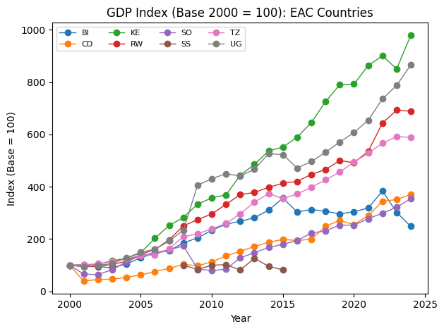
What does Indexed GDP (Base year = 100) mean?
When countries have very different economic sizes, comparing their
GDP in absolute terms makes smaller economies look almost flat on the
chart.
To solve this, you can normalize GDP values by setting
a common base year (e.g., 2000) equal to 100 for all
countries.
-
Each country’s GDP in the base year = 100.
-
In later years, GDP is expressed as a percentage relative to that
base.
-
Example: If Rwanda’s GDP doubles between 2000 and 2010, its index
goes from 100 → 200.
- If Tanzania’s GDP grows by 50% over the same period, its index goes from 100 → 150.
-
Example: If Rwanda’s GDP doubles between 2000 and 2010, its index
goes from 100 → 200.
This technique highlights relative growth rates rather than absolute sizes, making it easier to compare how fast economies are expanding, regardless of their scale.
👉 Interpretation:
- A country’s line sloping upward faster means faster growth
relative to its own base year.
- Countries with similar slopes are growing at similar rates, even if
their GDP levels are very different.
- Indexed plots are widely used in economics to compare growth across
countries, sectors, or regions on a fair scale.